Thursday 27 December 2012

Tessellation MADNESS!

TESSELLATION - It's fun once you get the hang of it!

Tessellation (or Tiling) is when you cover a surface with a pattern of flat shapes so that there are no overlaps or gaps.

When I first saw a tessellation (from my lecture's slide presentation, and he said that we have do to this) , The first thing that comes in my mind was; 

"WOW! How the heck am I gonna do this....Fish!!"

I really had no idea on how do you create a simple yet complex looking tessellation.

SO, OFF TO THE AWESOME INTERNET!

For better understanding on how to a simple tessellation and honestly speaking it was not as hard as is seams....you just need a REALLY long ruler and other drawing materials.

I took information,tips and tricks from this website, and I was doing complicated looking but yet simple to do, TESSELLATIONS!
____________________________________________________________

Now time for the presentation part!

We had to design not ONE but SIX tessellation and each of them had some criteria to fulfill and we must use the elements of design as our main focus on each of the design.

_____________________________________________


- CONTINUITY - ELEVATOR -
- I use a collage method with newspaper to finish this design -
____________________________________________


- PROXIMITY- TREE -
- Because Christmas was in the air, so I decide do to a tessellation for the occasion -
___________________________________________


- FIGURE GROUND - FISH -
- I used the basic concept of Ying and Yang, and created this tessellation -
___________________________________________


- CLOSURE - FRUITS -
- Honestly I don't know what is this fruit, but I did saw it from a fruit drawing book -
______________________________________________


- ALIGNMENT - ANTS -
- I like to observe ants when I was younger, and yes they walk in a line -
______________________________________________


- SIMILARITY - TASTY -
-YUMMS! nothing beats a strawberry sundae with cherry on top! -
___________________________________________


___ END___


Friday 16 November 2012

2D design basics


Today I will present to you my PAPER CUTTING PROJECT (applause) . each of the following picture, I have briefly explain on how did I use 2D design principle in each and everyone of my paper cutting project.

Most of my design I use Square as my basic shape and transform them into other forms making you normal average square more interesting. SO ONLY THINK IN THE 'BOX' or SQUARE.....

and I chose yellow because it is a very striking color against the black background thus you can see the design better

AND NOW WE BEGIN!!
______________________________


Repetition - To repeat a pattern

In this piece, I use a square basic and cut out other little square in that square...and inverted them to create this design. i think its very....tiles like? but when you stare to long...your eyes will hurt.
  
______________________________


Movement - The flow of the subject in one's art.

When you see this paper cut out, your eyes would want to start from the small square (bottom) and move all the way up to the larger square cut out. If your eyes moves in that way then I have achieve 'movement' in my paper cut out. YAY!
______________________________


Symmetrical balance - Balance between elements (same element)

In this paper cut out, I try to keep it simple but yet tedious to do but I did achieve the balance that I was going for.....
(thank god i didn't lose any piece from the cut out)
______________________________


Rhythm - The 'beat' and movement of subject.

This cut out was OBVIOUS inspired from Tetris. I use Tetris block shape to create movement in this cut out. if this was a real game I would have lost....
______________________________


Hierarchy - The order of the object

I have showed two types of hierarchy. the first one (top left) I have use a pyramid base shape but still maintaining my 'simple square' concept  the other one (lower right) was inspired by the equalizer in the car. Going UP and DOWN with the beat on the music.

 ______________________________


Scale - The difference in size between one shape to another

Its a game of big fish eat little fish...and bigger fish eat big fish. the circle of life~ 

 ______________________________


Dominant - one element rules over other elements

I was inspired to do this symbol after watching Tsubasa Tokyo Revelation, SO to commemorate this anime, I did this paper cut out in shape of a cherry blossom flower or 'Sakura' which is also the name for one of the character in the anime.
______________________________


Asymmetrical balance - Balance between balance (different element)

Achieving balance...but with different elements...but still balance...confused? so am I. but I will try and explain it to you with the help of Google and other notes!

Asymmetrical balance occurs when several smaller item on one side are balanced, a larger item on the other side, or smaller item are placed further away form the center or the screen than larger items

_______________________________

- DONE -


Sunday 21 October 2012

STEAM POWER!

Why is my post labeled 'Steam Power'? Well its because this week (well it was actually this topic was given two weeks ago but.... OWH WELL!) we have to do an art inspired but the era of STEAM-PUNK.

Steam-punk works are often set in an alternate history of the 19th century's British Victorian era, Americana "Wild West", in a post-apocalyptic future during which steam power was mainstream in the industrial world. Steam punk perhaps is the most recognizable features anachronistic technologies or retro-futuristic inventions as people in the 19th century.

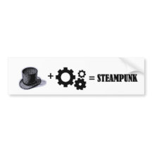
TO PUT IT IN THE MOST SIMPLEST WAY :-
                                                   
VICTORIAN ERA + GEARS AND STEAM 
= STEAM-PUNK


May it be and outfit, building, cats?! it could all be steampunk-efied!


 - outfit inspired by the era of steam-punk -

_________________________________________


- Building landscape -minecraft -

________________________________________


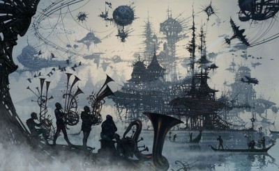
- Steam-punk inspired landscape -

_________________________________________


- Steam-punk air craft -


_______________________________________

Now with these concept in mind, I have to compose a landscape inspired by the steam-punk era and use these art technique to bring my art to life.


- LINE -

-This technique takes LOTS of patience and pen (or pencil if you are using it )  -


OR


- DOTTING -

-This technique take LOADS (and i mean LOADS) of patience -

________________________________________

But whichever one you use, you will have to stick to it till you finish with your landscape( it's in A2 size by the way)
________________________________________

MY TAKE ON A STEAM-PUNK LANDSCAPE


Voala! MY MASTER PEICE!

the building structure was originally from this illustration


but with a few editing here and there....I totally steam punk-afy it! ( I think)

and I also got my insparation for my work (over all) was from this dude


- TIM BURTON -

- HIS OTHER ART WORKS -


Truth behind the MASK

MASK IN CULTURE

Across culture and history, the face has been bestowed with incredible importance and power. Faces represent as a point of contact and their artistic representation, whether  human, animals or spirit.

MASK has been used for many centuries to express culture and spiritual believes  creating identities and transform personalities. In some culture, it is to said that spirits and ancestral beings can inhabit in a mask. thus making the wearer endows themselves with new power.
________________________________________


- Mask of Garuda - Bali -
________________________________________


- Korean Hahoe Mask - Korea -
_______________________________________


 - Dia de los Muetos Figure - Mexico -
_________________________________________

_________________________________________

MASK IN EVERYDAY LIFE


_________________________________________________________________________

From then picture above you might have guessed what are mask use in today's society. If you have guessed to protect one face form sun burn, then you have guessed WRONG. The correct answer is to protect one's identity form the rest of the world. Much like this super hero, WE (as normal citizens of the world)  have created our own mask that we use in our everyday life but we just don't have ACTUAL masks for these mask (kinda like invincible mask...in a way) and we unconsciously put them on when we need to.

"Have you ever seen a friend of yours do something that shocked you the very core? Something that made you think, “I thought I knew him/her, I didn't know they’d be like that”? "

- internet anonymous -

The existence of there ask can be seen in the fake laugh and smiles that explodes form a person who tries too hard to look good to empress someone.

“The worst lies are the lies we tell ourselves. We live in denial of what we do, even what we think. We do this because we’re afraid. We fear we will not find love, and when we find it we fear we’ll lose it. We fear that if we do not have love we will be unhappy.”

- Richard Bach - 

If you are telling yourself that you're not wearing a mask by the end of this post, have you ever thought that MAYBE you got too use to wearing a mask that you don't notice it anymore?

_______________________________________________________________________________________
_________________________________________________________________________

PS : My blog post is not in order.....sorry...


Thursday 4 October 2012

Komoidia!

Well that is comedy in Greek.

But what is comedy? Define comedy?

To my understanding, I would consider anything (and I mean ANYTHING) to comedy if it makes me laugh?... for example....


- My American Accent - Charlieissocoollike 

And this is the topic for this weeks activity.

 To Entertain the Whole Class (yey...)

To start things off....i have no idea on how to tell a joke to a large number of people. I mean its not that I have never told any joke in my life (don't get me wrong! I have) but it was all...random jokes? the ones that just comes to you at that moment of time? ... and most of it comes from a video on YouTube.

Like this one :-


- The Best Joke Ever - Nigahiga

When me and my friends just re enact the jokes from this video we can laugh our asses off!

So long story short... I HAVE NEVER PLANED MY JOKES!

And now my journey to Google begins...starting with 'what is comedy?'

Well according to Wikipedia,
Comedy is any discourse or work generally intended to be humorous or to be amuse.

Even with this information still...I don't know how to tell jokes to a large crowd.

Then I went to ehow.comtoastmasters.org, and a couple of other websites on 'How to Tell Jokes'

A tip that I MUST keep in mind is..... not to LAUGH AT MY OWN JOKE (Which will be hard for me because .. I laugh easily...) . Other than that...they told me to commit to the joke, don't tell the audience how funny the joke is? (okey...) and ALWAYS keep eye contact. (VERY IMPORTANT POINT)

So fingers crossed.... and hope I will succeed in entertaining the whole class...


Monday 1 October 2012

My Self-Portraits!

CONTEXTUAL STUDIES


For contextual studies where suppose to make a self portrait that best reflect our personality and choose a style of art to portray your self.

And this is what I did!

Four picture of myself just being me! The 'person' on my finger is suppose to be a miniature me (notice the same hair style and I like drawing on my finger!) . Each picture was taken with a different pose and this is what usually what happen if I get my hands on a camera or  in front of a mirror!

I guess that just ME being ME!

______________________________________

2 DIMENSIONAL DESIGN


If you have been following my blog, you might have seen this portrait  Well just so you know, that is because this is the same one. BUT! with improvement!

From the previous post, I added detail on my face with little pebbles,a white shell makes my eyes come to life (or so I think it does) and also a necklace made out of small pebbles and a seashell for the pendent! 

Now I know that pebbles are not biodegradable. But still, They come from mother nature!

_____________________________________


Thursday 27 September 2012

Biodegradable stuff only!

Continuing my search on find the answer to this very big question, What is 'Self- Portrait'?. Mr Charles have decided that the entire class (all 26 of us) to do our very own self-potrait with only things you can find around your house (no buying is allowed). So let us begin!

STEP ONE :- take a picture of yourself. 


    - Original -       
______________________________

                                                           
  - After it went through intense editing in the phone-
_______________________________


STEP TWO :- Start sketching the shape of your head on to the paper. Once your done start coloring or gluing stuff on the paper and it should look some thing like this.


- Natural Self by Munira (2012) -

 I decided to only use things that comes from trees so I choose a paper that was not white ( it's kinds grayish ), the outline for my face are all small twigs that I got from cutting a big tree at my house, my 'curly' hair is made out of dried leaves also comes from the same tree. My T-shirt is made from a special tree bark that comes off on it own and for my background I use small leaves that are still on their branches to give you that natural effect and feel.

*Note:- this is not fully done yet! it is still in the stage of editing and trying stuff on it. Like what Mr Charles said 'you don't have to rush, take your time to finish it' 


Self-Portrait


When I first heard Mr Charles said self-portrait, the first thing that comes in my mind is ‘camwhore’ aka people who likes to take pictures of themselves. For example :-
- Myself by Munira (2010) -

Self-portraits in my point of view are paintings or picture of the artist by the artist.

According to Wikipedia, A self-portrait is a representation of an artist, drawn, painted, photographed or sculpted by the artist. Self-portrait has been here since the earliest of times but it was around since the mid-15th century (early renaissance) when it was really got popular. ‘Portrait of a man in a Turban’ by Jan van Eyck of 1433 may well be the earliest known pane self-portrait.


 - ‘Portrait of a man in a Turban’ by Jan van Eyck (1433) - 

Self-portrait may also be a portrait of the artist, or a portrait including in a larger work, including a group portrait. Many painters are said to have included depictions of specific individuals, including themselves, in painting figures in religious or other types of composition.

Other examples of self portraits by other artist :-


- Juan Salmoral -
________________________________________


- Fergus Ray Murray -
_________________________________________


- Haroni Kim -
________________________________________


Tuesday 25 September 2012

New Semester, New Blog

Been off from Blogger for quite sometime. But now I'm back! 
This Blog is Totally dedicated to my new subject, Contextual Studies. 
To kick start this blog, Pusheen will show you how to make a Pizza!